My role
Lead product designer, visual designer
Lead product designer, visual designer
Collaboration with
Engineer and company founders
Engineer and company founders
Timeline
2 weeks
2 weeks
Platform
Desktop + Mobile
Desktop + Mobile
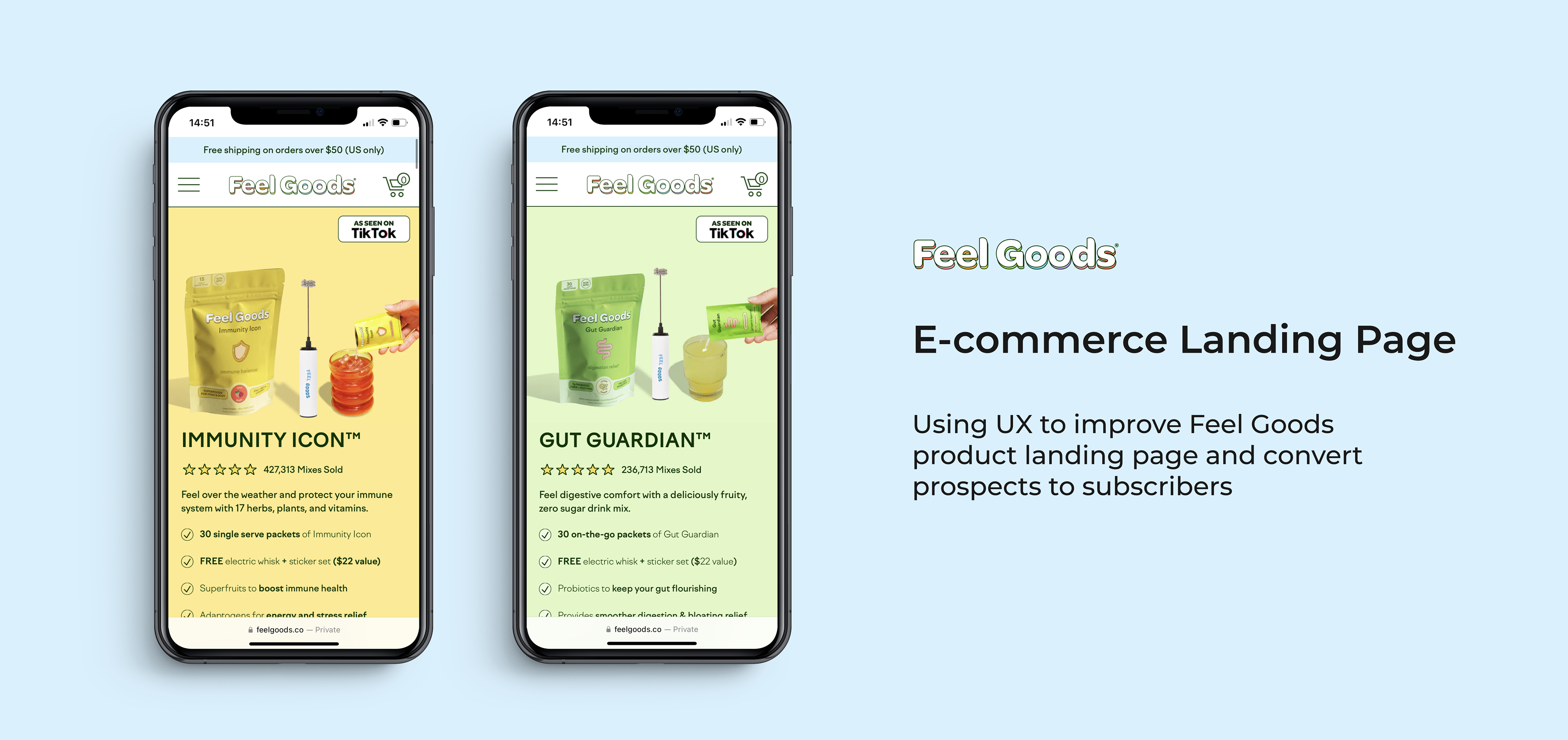
Feel Goods offers healthy drink mixes to support immunity and gut health
A health and wellness brand started in Los Angeles, Feel Goods has a mission to provide the community with drink mixes that are actually good for the body with a refreshing taste. Think organic, non-GMO, keto friendly, vegan — and best of all, zero sugar and artificial flavors.
The problem is that not enough prospects are converting to subscribers
Majority of e-commerce businesses rely on repeat purchases and increase customer lifetime value. One of the best ways to do this is through subscriptions which Feel Goods was having trouble with. When their customers arrive on the landing page, they are not getting interested enough at first glance to add to cart and purchase.
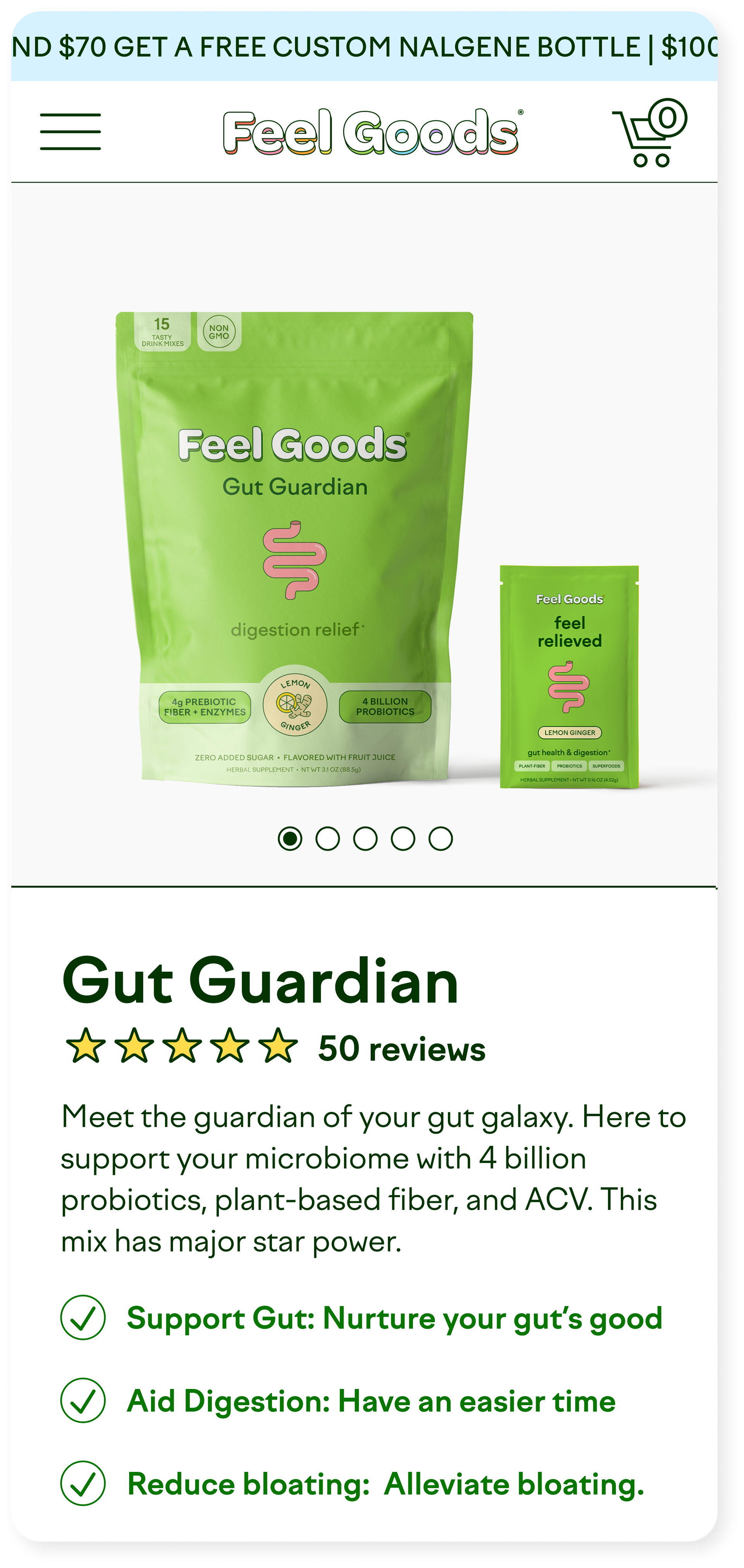
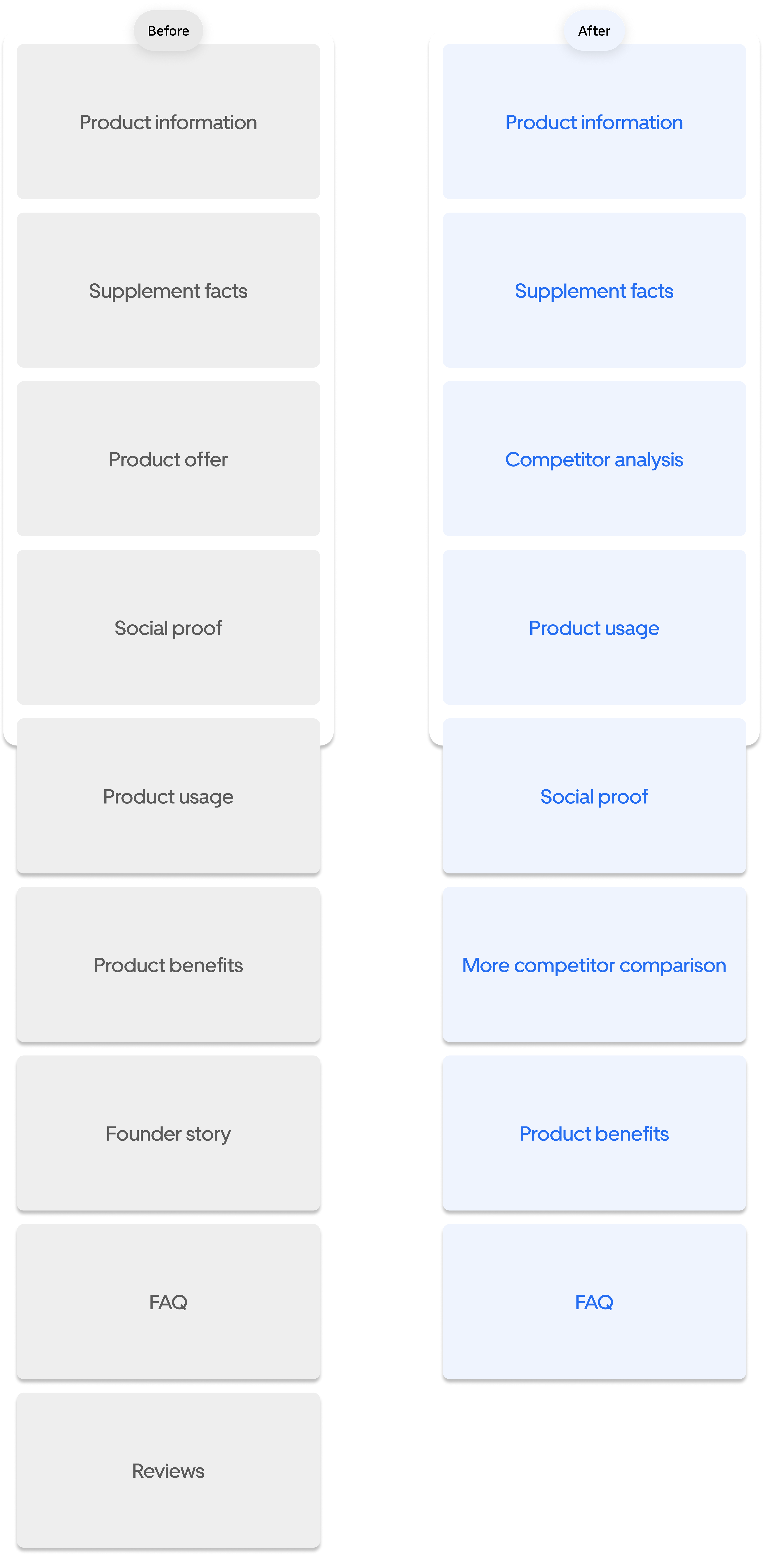
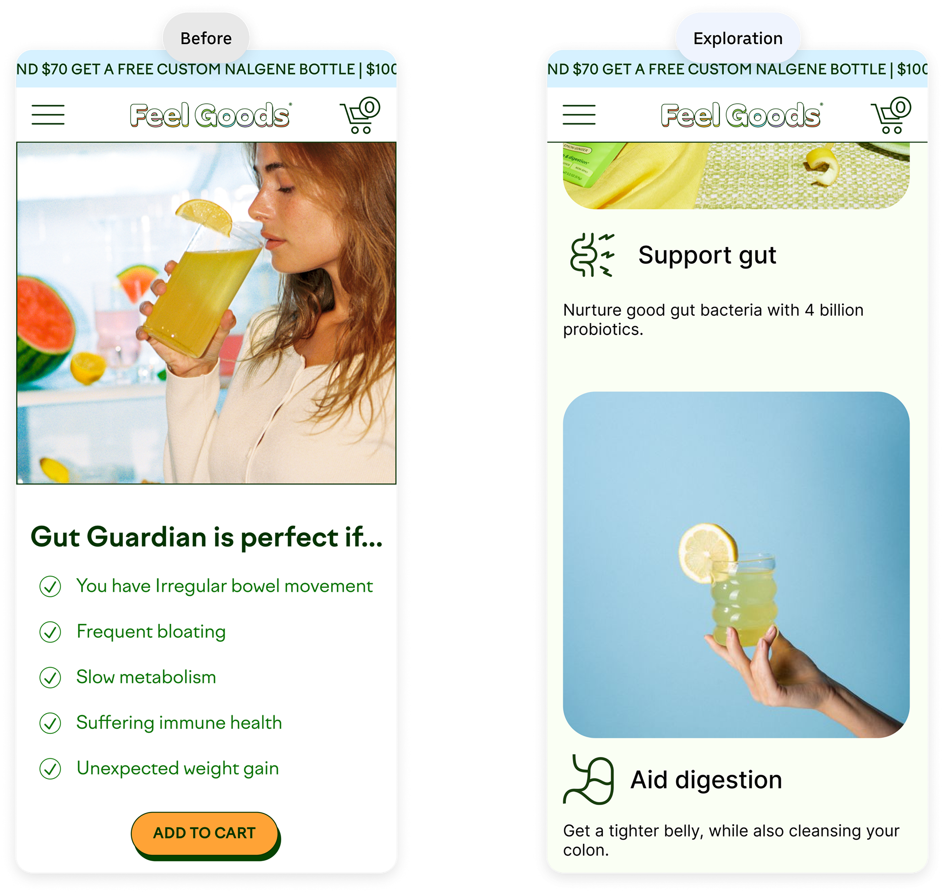
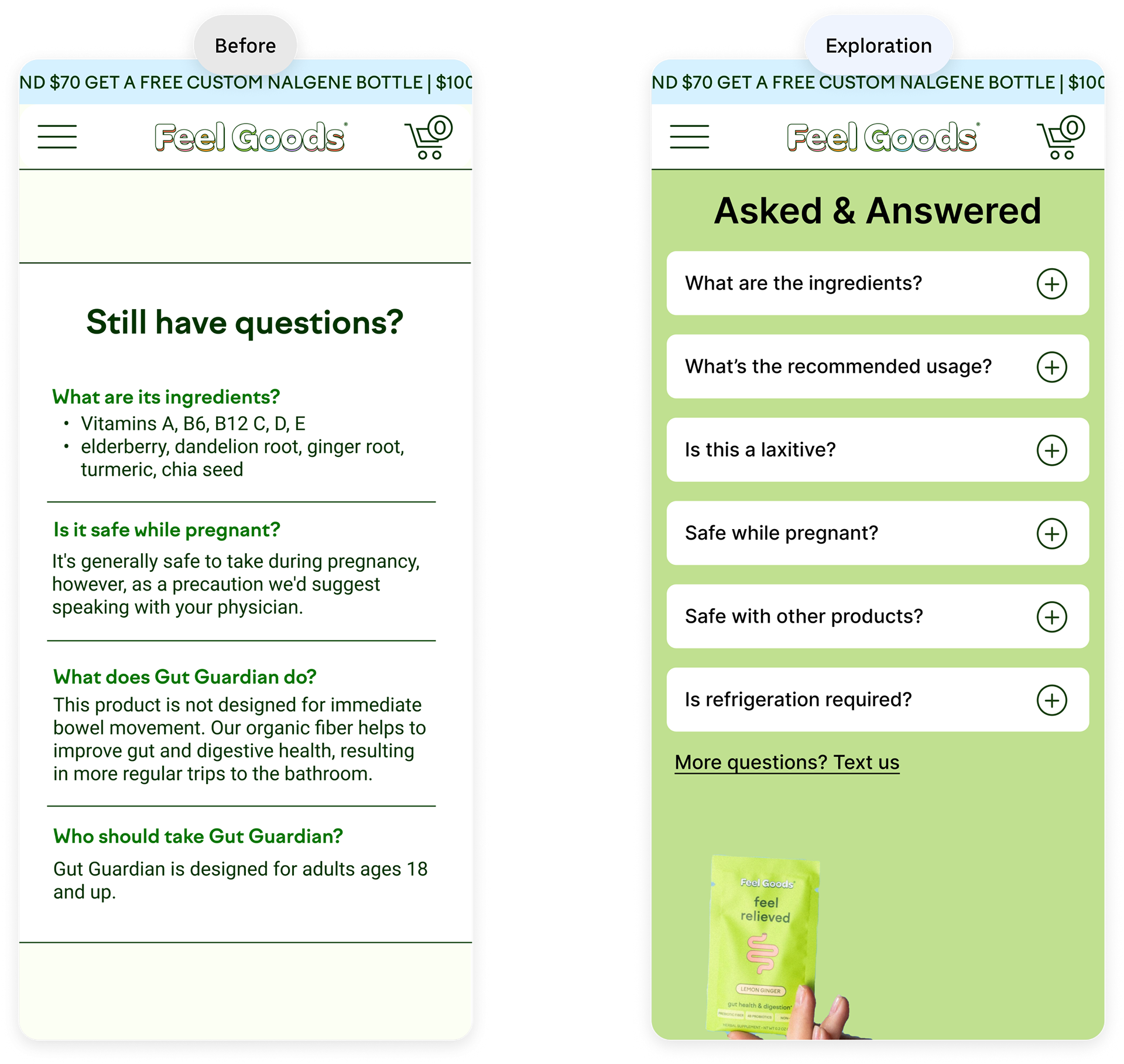
First section of previous landing page
The solution is to redesign, highlight benefits and capture interest
The goal is to feature an attractive first time offer and make subscription the highlight. Customers should understand the offer easily and long term benefits of being subscribed to this product. They will be more convinced to purchase the product with a new landing page that's easily digestible and scrollable.
The new landing page redesign launched in March 2023.
Outcome: metrics improved?
After A/B testing against their current product page, here are the results.
2.5x
subscription conversion rate
2x
session duration
My design process
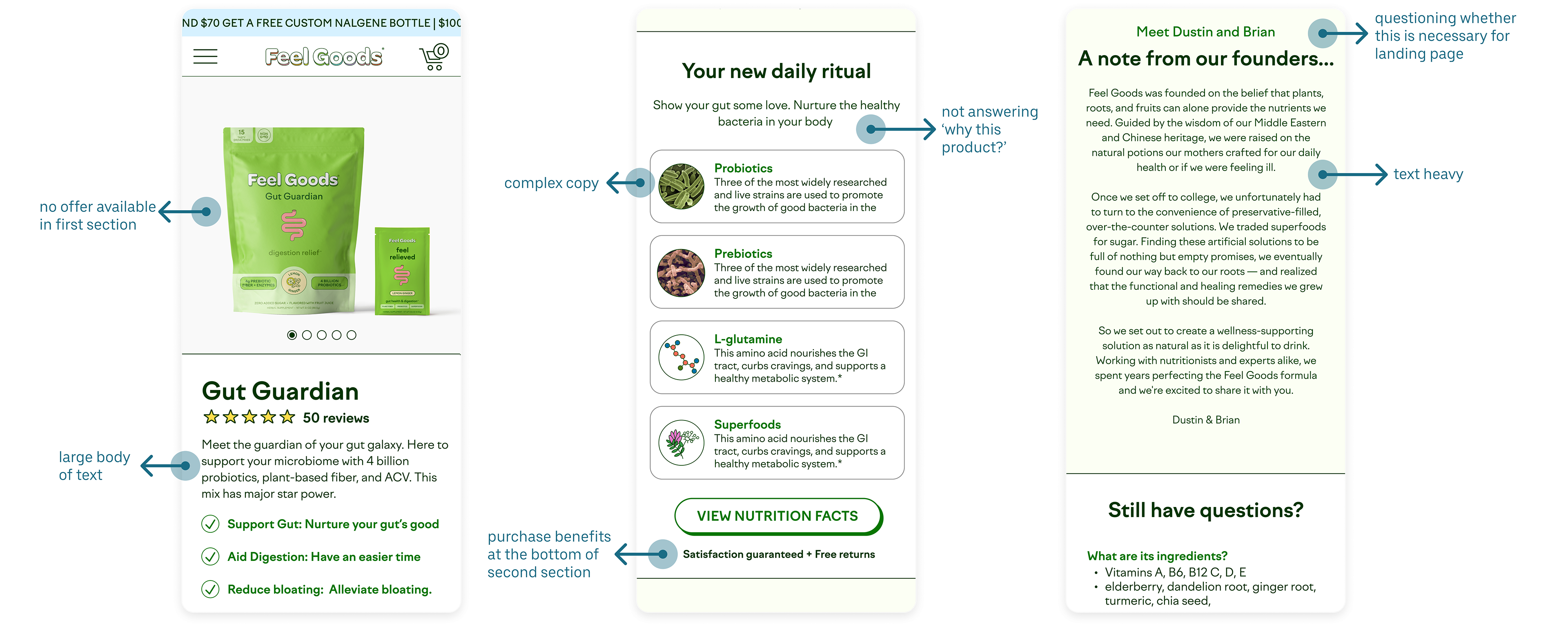
Discover: previous experience
Since there was a time constraint of 2 weeks, I first went through the previous experience and tried to pinpoint areas of opportunity. I also analyzed data that the founders provided on when and where users tend to drop off from the landing page.
My top insights from doing this was:
1. Product offer was in 3rd section
2. Multiple areas of high cognitive load
3. Text heavy and not scannable
Define: look into what's working
Then I did research on the e-commerce market to see what other product landing pages are doing successfully. I paid special attention to the different sections, offers and information architecture each displayed.
Doing this made me realize that they all had a similar layout which led me to my design skeleton and anatomy.
Develop: exploring concepts
Feel Goods already had some good information on their landing page that just needed some rearranging and simplifying. So I started my exploration working with what was available like...
1. Showing an offer up front (subscription)
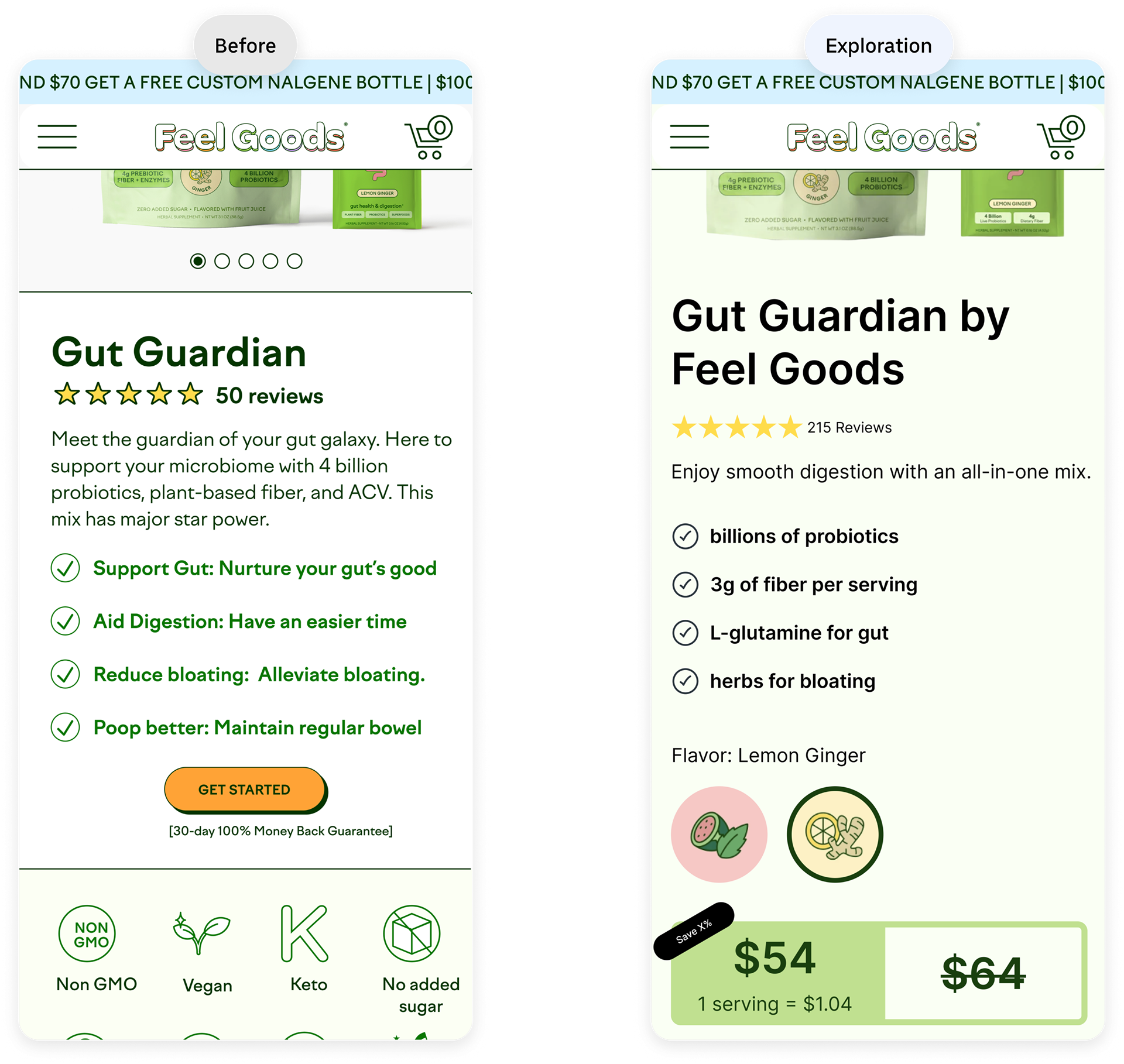
2. Making information more scannable with images
3. Reducing cognitive load with collapsable components
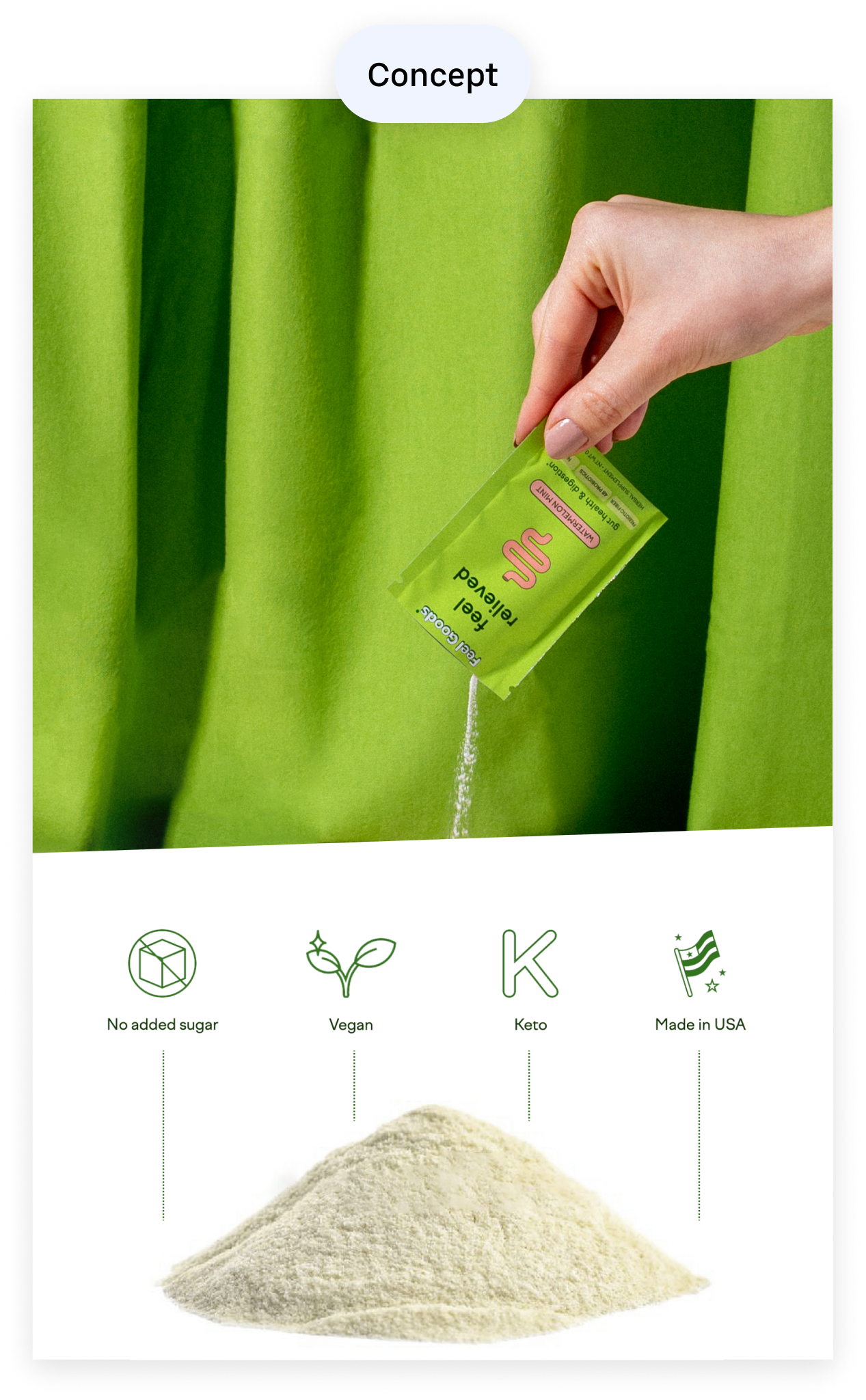
Then I moved on to sections we were missing, focusing on competitor comparison. This information is critical in converting prospects to subscribers because we really have to convince them on why this product is better than others. So I created concepts like...
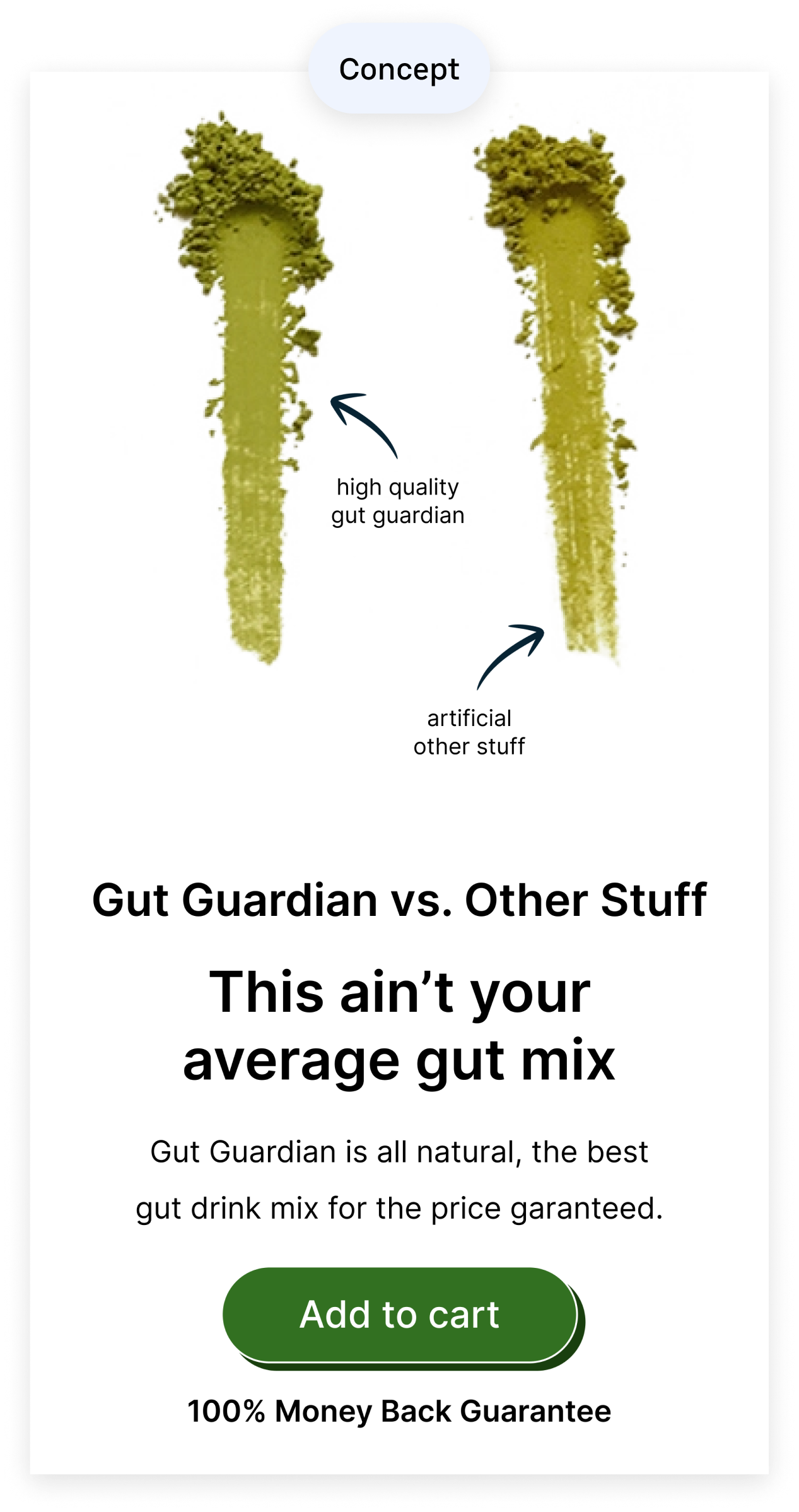
1. Cool visual showing the drink mix and it's natural benefits
Before touch up
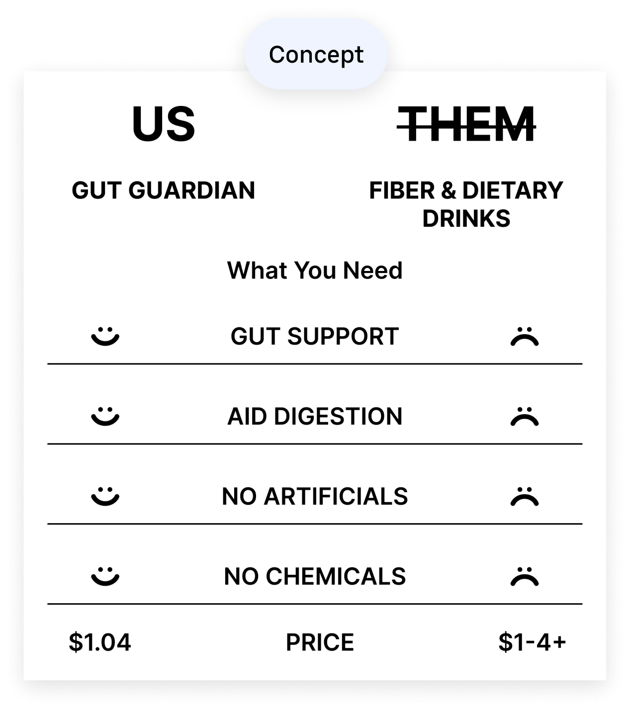
2. Comparison chart of their product vs. others
Before touch up
3. Visual comparison of their product vs. others
Before touch up
4. Persistent sticky CTA to add to cart
After exploring different explorations and concepts on my own, I had a design review with the founders to get their thoughts and feedback.
Deliver: Final design
I iterated based on the feedback and further developed the concepts I explored to get to my final design for all their products. I also made the design responsive so that it could be viewed on web or mobile. I ended with working alongside the engineer in order to ensure the new landing page experience was being implemented correctly.
Takeaways
Alignment
Not everyone understands user experience and design decisions. I had to explain design in a way where I put the stakeholders in the user's point of view in order to get alignment.
Constraints
This was a relatively short project that was done in 2 weeks so there was a time constraint and areas we had to compromise on for v2 in the future.
Use what’s working
In this technology age there’s so much information that can be found online. Doing research on successful landing page design patterns helped me save time which allowed me to stay within the constraints.